


Table of Contents Show
The actual initial topic was the increasingly frequent question from colour grading colleagues, but also from production companies or post houses: How well suited are Apple‘s latest iPads for colour grading acceptances that have the new “reference mode”? Reason enough to deal with both topics at once, as they inevitably belong together if you want to be able to answer the question of suitability. I looked at two current Apple devices: the iPad Gen 6 and the latest MacBook Pro – both with the Liquid Retina XDR.
Externals
What makes the reality even more complex is the question of whether to use the internal/own displays or other computer monitors. You could avoid the problems as far as possible if you used reference monitors on a video IO for colour grading control and not the internal graphics card output on internal or external displays.
However, using external monitors requires even more expertise: I was just called to a colour grading suite at ZDF where a colour grader was sitting in front of one of the most expensive reference monitors you can currently buy: a Sony BVM HX310. It was supposedly not calibrated. After all, the colourist noticed that the colours could not be correct (too saturated compared to the GUI monitor).
However, it turned out that the HX310 was not set correctly: instead of Rec709, the HX310 was on the P3 colour space. The Windows computer and Resolve with its GUI monitor were set to Rec709 output. Such a combination is normally less prone to errors compared to the Apple workflow, provided the users know what they are doing.
So what are the boring basics?
The studio standard, which is still the worldwide standard in colour grading and VFX workflows, is still Rec709 (identical to sRGB in terms of colours), only in cinema or HDR is P3 (the latter embedded and limited in BT2020/BT2100) common in delivery as a colour space, but by no means always used to its full potential.
It is not uncommon for Rec709 to simply be addressed and displayed in the P3 colour space or even embedded in BT2020. This can work well if you transform cleanly between these two colour spaces. This usually works in a colour-managed workflow, but the more settings that can be set, the higher the error rate. But this is the crux of the matter: users and colour management must both work well together ;-), especially if the monitor is set to P3, which has been the case with Apple’s Retina displays for many years and not just since the XDR generation.
Rec709
Let’s get back to the Rec709: The following decisive secondary conditions must be observed, which are often overlooked: The dear monitor gamma, which was unfortunately forgotten to be defined in the standard, but which was also more or less fixed in the days of CRT monitors: gamma 2.4. Only with cinema or today’s modern monitors has the gamma (become) variably adjustable to suit: in dark cinema 2.6 and in office light conditions (as preset on most computer monitors): Gamma 2.2.
It is important to note that the gamma is only and exclusively set on the monitor to match the ambient light and is never changed or adjusted during export. This is where the first application errors occur. Because theoretically an adjustment is possible and is therefore all too often done due to a lack of expertise and voilà: The export looks different for this reason alone.
If this is not noticeable, it is due to incorrect monitor settings and/or incorrect ambient light conditions. The latter are defined for Studio Gamma 2.4 = 10 per cent of the peak white level, which is 100 nits (nits = cd/m²). This is achieved by completely banning daylight from the room and using some D65 (6500 Kelvin) compliant white light (bias light), i.e. not using the usual warm light sources.

And now iPad?
If I want to use an iPad as a reference device, I have to create studio lighting conditions, because it is set to gamma 2.4 in reference mode. Using it in an office/daylight environment is therefore pointless. I’d rather use a better TV or graphics monitor that can be set to gamma 2.2, but also at least provides an sRGB or Rec709 preset.
At least you can’t set anything wrong on the iPad in reference mode. This could be categorised as Apple-typical “user-friendly”. It is more complicated on MacBooks, there is no “reference mode”, I can and should set and adjust the colour spaces correctly via the monitor settings as on a reference monitor, and at best also calibrate them.
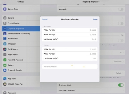
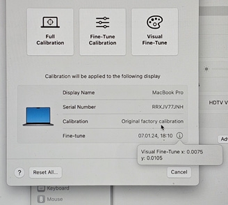
The 6th generation iPad Pro is absolutely “reference-capable” when calibrated – because you can at least calibrate the white point on the iPad, as with any “professional” reference monitor. If the display has been well constructed and well calibrated, no more is necessary. However, this process is complicated and not really interactive. You need a calibration probe with an x,y output or display, ideally something like a Jeti 1511 spectroradiometer, which provides exactly that.
It’s a bit strange that you can’t enter 100 nits for the brightness, the setup only accepts values below that – but this is hard to tell visually if you only get 93 nits instead of 100. It took me several attempts to get the calibration to a good value. The software does not deliver the value that you set and that was measured. If you measure again after the accepted setting, you realise that the final value is slightly off. You then have to “shoot” just right to achieve a precision landing. After a few times back and forth, it worked. In my case, a reset to default improved things even more.

The background
So far it looks good, but here’s the thing: For a P3 display to show Rec709, a functioning colour management system is required. This presupposes that both the OS and the respective software are capable of communicating with the colour management. DaVinci Resolve and Apple’s own Quicktime Player are capable of this. However, for the Quicktime Player, certain flags (metadata) in the video files are also responsible for whether or not certain standards are used. And here Apple has (historically caused) a system design deficiency in colour management: they use an outdated gamma. To “correct” this, a special flag is required in the .mov/.mp4 file if it is to be played back correctly on Apple devices: NCLC does not have a transfer function specified in meta tags for Gamma 2.4 – so tagging “1-2-1” tagged for Rec709 Gamma 2.4 reads the “2” in the 1-2-1 tag as “unspecified”, so Apple Colorsync (the operating system) ignores it and applies the internal incorrect gamma.
The result
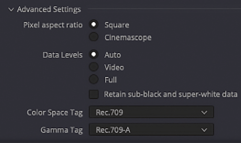
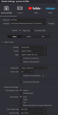
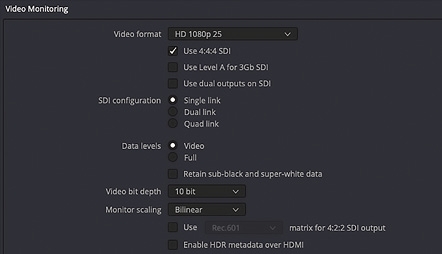
And (almost) every player on a Mac displays the file with gamma 1.96, which is a far cry from gamma 2.4. So people check their files on a Mac (which by default uses Quicktime, a colour managed player) and the files are displayed washed out with too flat gamma. However, this can be torpedoed and obscured if Fullrange vs Legalrange is used, which depends on the colour management/codecs and export setting. However, the standard is legal range (video level measured externally = 0-100 per cent – but be careful, the display of the internal waveforms in Resolve or other programs show what is processed internally, which is usually 0-100 per cent full range and not legal range, which is what is to be exported. So Rec709 is actually exactly Rec709, gamma 2.4, for 100 nits at 10 nits ambient light in D65 and white point D65 at legal range (note: legal range is at 8 bit = 16-235 or 10 bit = 64-940) When exporting from Resolve, the Rec709A setting can now be used instead of Rec709 – Gamma 2.4.
The NCLC tag
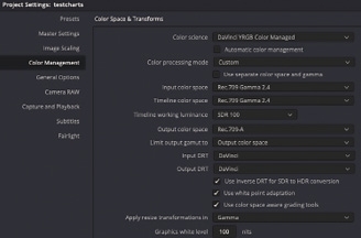
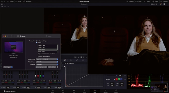
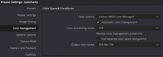
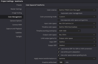
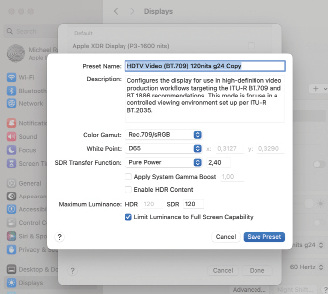
And now this leads us to NCLC tag 1-1-1. This flag does not lead to any burn-in of other gamma, but only to a correct display of gamma 2.4 on Apple OS operated colour-managed applications, if this has been set on the display – which is the case by activating the reference mode on the iPad Pro. A preset must be created for this on the MacBook. Minimum settings in DaVinci Resolve: Only amateurs use CSTs in Resolve, the professional who works as efficiently as possible uses DaVinci’s YRGB Colourmanaged CM. This allows you to define the target for the subsequent export and correctly address the metadata for the send files, especially if different colour space targets are required. This often occurs with Rec709&HDR in combination with today’s streaming platforms… So first set the white point and colour space optimally and then calibrate the white point. If everything is set and calibrated correctly, an optimised display preset must also be set in the OS. Here it is still set to P3-1600 nits: reduced to 45 per cent brightness:
Conclusion
This may come as a surprise, but Apple’s current colour management actually works – if it weren’t for the Quicktime flag problem, which Resolve solves with the Rec709A (the A stands for Apple) export flag (1-1-1). As this flag can ensure correct playback on Mac OS and has no effect on Windows, you should always export with it even in Resolve on Windows, then the files will also look correct on a Mac, even if the Mac laptop display is “incorrectly” set to P3 1600 nits. But you can achieve real perfection with a Rec709 display preset. Both the Macbook and the iPad Pro with the XDR displays are absolutely suitable for reference if the listed conditions are observed. However, if you use an external reference monitor with a Windows system or Mac system that is incorrectly set to P3, then the user loses out and an expert is unnecessarily called in to calibrate. In this respect, self-contained systems such as the current Apple devices are one level less error-prone. But as the social media forums impressively demonstrate: This doesn’t really help. “KnowHow is king” and that is here and not on social media ;-)