We look at the interplay between image design and colour grading, which tools they use and what the release of Baselight version 6 of Filmlight has to do with this. Because when it comes to look, the exchange between DoP and colourist remains the core of any further development and the basis for mutual understanding. We have recorded the dialogue between DoP and colourist on the subject of look development.


Lou: What do you consider to be part of look development and when do you prefer to involve a colourist?
Matthias: For me, look development is the basis for bringing the story to be illustrated to life as a DoP. It’s about defining the parameters that visually support the content and its dramaturgy. For “world-building”, lighting and colour design are one of the most central creative visual elements and also affect other departments such as production design, make-up and costume design. As soon as the approach has been found with the director, I involve colourists and they are my sparring partner in the pre-production stage. What can and what do we want to determine before shooting starts? How do we transport a fundamentally defined visual approach into the look finding process and then later into the shooting? I usually create a mood board with collected stills to illustrate and describe the look we are looking for. This then leads us together to a visual approach that also defines the patterns. A close approach, especially during the first rushes, goes without saying. Going into the final grading with the same partner rounds off the collaboration and overall concept.
Matthias: What do you mean by look development and why is it so topical?
Lou: Ultimately, it’s about making the viewer “stick” and say: “That looks interesting!”. When I was a young teenager, you had to walk past the cinema to find out what was on. I loved looking at the posters in the illuminated display case in the evening. And it’s that moment when you’re captivated by the visuals that makes you stop and move closer to the cinema. Today, we watch trailers and teasers or “zap” through various VOD platforms. The image is usually the first thing the viewer consciously notices, long before they get to read the text about the film. The first image impression also has the chance to make the first statement about the film. The aesthetics and visual power of an image are therefore part of the first spark that jumps across. In my opinion, the look is an essential part of this.
Lou: What do you expect from a colourist in the look development phase?
Matthias: Basically, I expect the grading team to be prepared to go on a journey with me, to be open to new things and to be willing to embrace unusual approaches. I also expect them to have a good command of the grading tool and to be up-to-date in terms of design. It is always ideal for a fruitful collaboration if there is an interest in current filmmaking and everyone is also interested in other art forms “cross over”. Sometimes this kind of out-of-the-box thinking can also lead to new approaches and exciting mutual influences. I always look forward to this mutual inspiration and it leads to new ideas and joint interpretations of the material.
Matthias: What would you like from the collaboration with the DoP in terms of look development?
Lou: I would like to tap into my technical, but above all artistic vein at an earlier stage. For me, early involvement is not necessarily about being allowed to say a lot, but first and foremost about listening. Only then can joint ideas follow. This can go so far that I have already had meetings with DoPs in which we have jointly considered on set and lighting plans how we can turn the visionary image into a finalised image. My job is to capture the DoP’s vision and combine my imagination with my skills in such a way that I support them in creating and shaping this image.
Another desire is an awareness of the value of dedicated pattern grading by a qualified colourist. Pattern grading is the be-all and end-all for establishing a look, and also serves as a technical and creative check of the material, and therefore cannot be replaced by a show LUT.
A dedicated pattern grading involves first understanding the camera work technically. A look at the reports and metadata is revealing. Especially when older lenses are used, written reports are always helpful, as not all optics can be read in the metadata. It is just as important to receive the frame leader and set up the image format correctly.
What a sample colourist does is closely linked to the visual design, because their skills are part of the craft that makes artistic design possible in the first place. It is therefore important to first be able to assess the visual and technical parameters for the design.
Colour charts during tests can be helpful if an image deviates slightly from the visual “course” at the beginning or if you want to bring different cameras closer together. Rough initial points of reference are the so-called 18 percent grey, the technical zero aperture, the diffuse white, the peak white and the black. I can use these reference points to judge both the actual exposure, the subject contrast, and my technical contrast in the look. Often the film gate provides a white area and sometimes also the primary colours, which can be used to quickly identify whether something is wrong with the image or the look.
Colour charts can be helpful for tests and for creating an on-set LUT – but by no means exclusively. An on-set LUT should be as “stable” as possible. That’s why you have to technically test it with aperture rows, various material colours and textures as well as different light sources. As soon as the first look for the on-set LUTs is created, the technical points of reference mentioned above should also be evaluated from a creative point of view. However, under no circumstances should the LUT lead to the DoP “incorrectly exposing” into the LUT. Close consultation between DoP and colourist is essential for high quality goals and cannot be “saved” by simply applying the LUT to the samples.
Subsequently, however, it is not necessary to hold a colour chart or similar in the frame for every take. Colourists will not concentrate on technical aids when grading patterns, but on the essentials. We don’t cut colour charts or flaps into the film, so I don’t grade them either. I’m interested in the above-mentioned reference points from the point at which the image composition of the take begins, because that’s where the editing starts. Pattern grading therefore also requires the talent to anticipate connections for a possible cut and to design action spaces coherently within the desired look. The DoP’s technical understanding and content-related feedback is therefore essential in order to push the film material in the desired visual direction.
In the samples, the image is revealed for the first time, which burns itself into us visually during the editing process, resulting in various consequences for creative decisions. For example, I’ve found that darker images stay longer in the edit, so they don’t get recut as quickly, which can affect the pacing of an entire film.

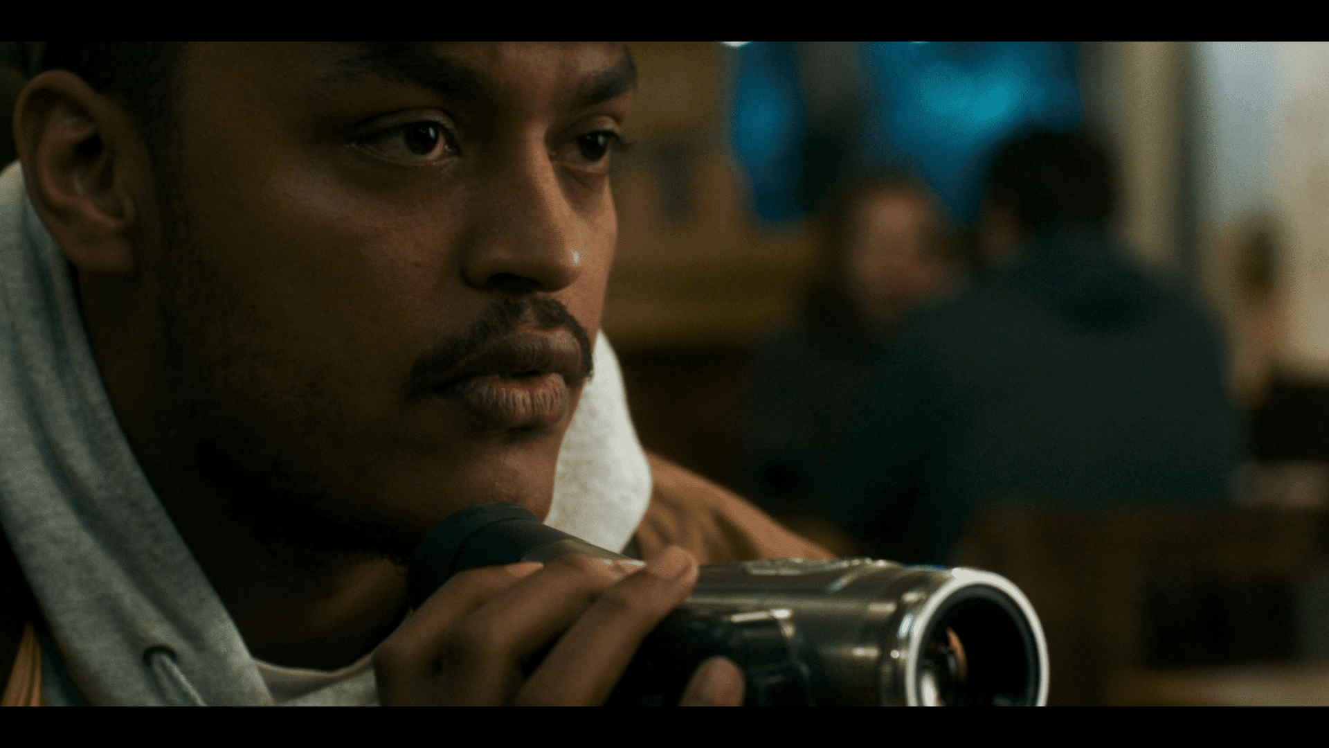
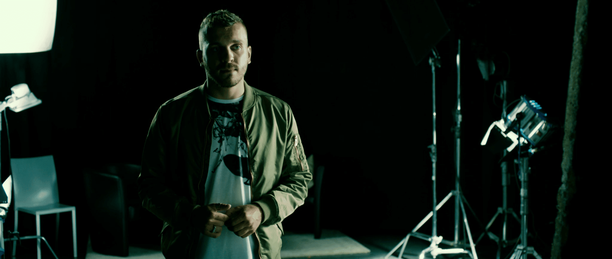
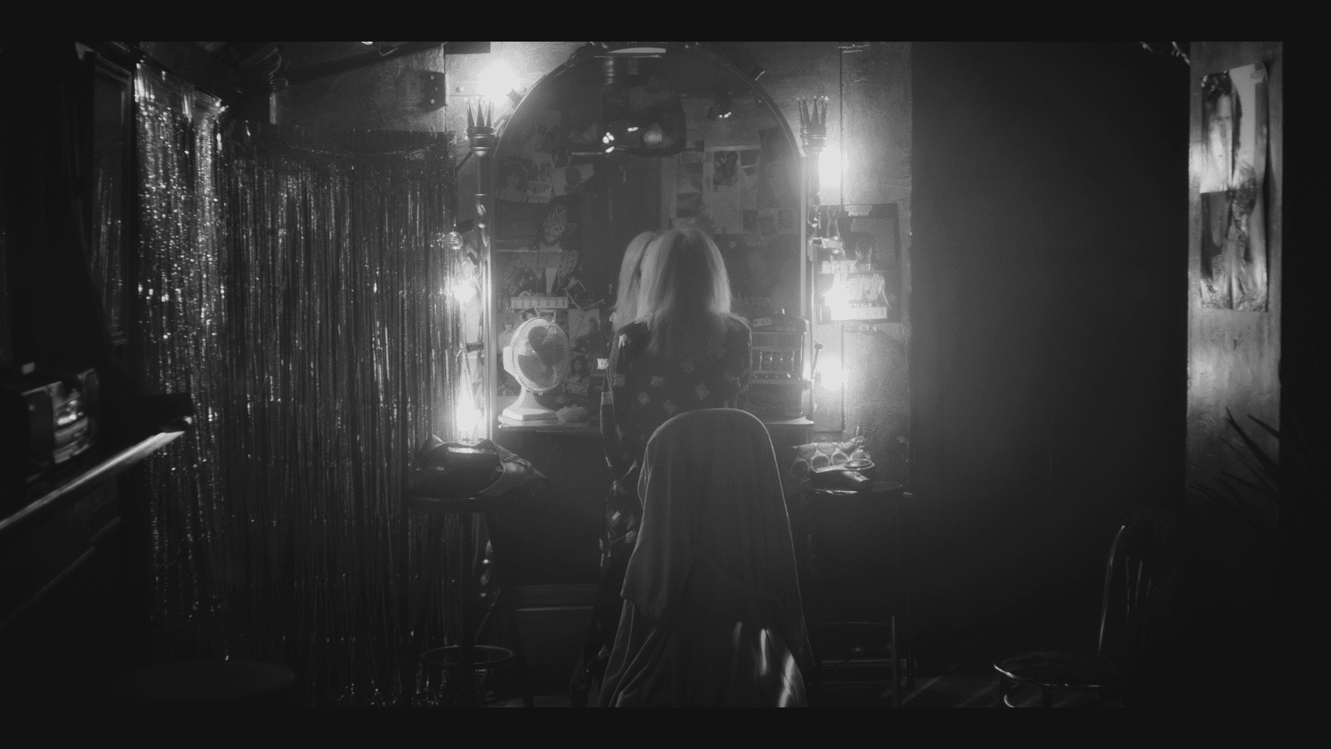
“4 Blocks” (2017-19) below, the same location in the spin-off “PARA – Wir sind King” (2021/23).
Lou: How do you prefer to work with the colometric properties of the camera and the colourist? What do you test, what do you create with the colourist in preparation for the work on set, or for the various later exploitation goals (cinema, SDR, HDR)?
Matthias: I think you always have to understand your camera and the defined playback system. What can the media achieve in combination – and what not? There are often other parameters that can be decisive depending on the production and setting, such as the weight or size advantages of a particular camera, which then outweigh technical parameters such as maximum contrast range or the most accurate colour reproduction. So if I know where the limits of my overall system lie, I can work around or compensate for weaknesses accordingly, e.g. by increasing the brightness or changing the saturation of primary colours. Know your system like the back of your hand – then you will feel confident and be able to dare more. The same also applies if I add a cheaper B or C cam, for example. In the end, the images from both camera systems are blended and have to work – but you may have to treat one camera slightly differently to the other. And exactly this system of “getting to know your tools” also applies to colourists. A test shoot, a so-called screen test, is very helpful, where I test the basic “look & feel” of the characters in costume in the appropriate light with the desired camera/lens setup. The key thing for me is to have the original cast on location if possible. I want to photograph them in a “hero” costume in an environment and light similar to the film setting – with exactly the same technology and sensor/glass combination that I want to use later. I would advise shooting at least one wide shot and at least one close-up. If you want, you can hold a Macbeth colour checker in the picture, which gives a clear technical reference, but I usually deviate from the technically perfect guideline in terms of design with white balance and the desired look. Then specials should also be tested so that they also run through the entire post chain. These test shots also form the basis of a joint look development for the samples or for specially created look-up tables for the set.

Matthias: When do you describe your work as successful?
Lou: My work is successful when the film’s cinematic message is strengthened by the grading process. Creating the look with skilful flair is my creative goal. For a successful grading, we weigh up together in advance how far this quality goal can be achieved within the time frame. I ask about the wishes and expectations regarding the grading and discuss what is technically feasible. If the incoming film material is consistently exposed, follows a clear visual concept and is technically flawless, it provides a good basis for artistic refinement in grading. This ideal situation is not always the case. That’s why I first have to sort the material visually. This often requires good time management. My aim is for the DoP, director and production team to be satisfied with the result and to leave the digital darkroom successfully – and in the best case scenario, me too.


Lou: How much of the look do you think can be achieved through grading these days? How much do you “bet” on grading? Where are the limits of grading for you?
Matthias: Grading has become more differentiated and complex over the years than in analogue times, when you could only define film stock, print emulsion and copy lights. Nevertheless, even back then there were still designs and impressive realisations – purely with production design, props, camera glass filters and lens selection. Digital colour correction can now do a great deal more, starting with an extensive starting position in the run-up to the shoot and finalising the overall effort at the end. But it doesn’t create the look alone. For me, the adjustments on set remain the basis of the overall look development – it is the “production design” that should be appreciated. That’s why production design is my favourite department on a film set, apart from my own. Just as talented actors and actresses are an ideal basis for every director, a coherent production design is the best starting point for the final look for me.
What comes into play as a political aspect, however, is the fact that the patterns generated once on the set of a feature film are watched and processed every day for six months. Then you can get used to a simple Rec.709 preview look and the director or producer is surprised at the end if the DoP changes the grading more in the final. That’s why I’ve got into the habit of bringing the samples very close to the final grading. At least as far as the general contrast and the basic colour scheme are concerned. This saves a lot of discussions afterwards. It also makes it more fun for me to look through the viewfinder with a dedicated look on set and think, yes – this is our film!
Matthias: As a colourist, what can you say about the “fuss” surrounding Filmlight’s Baselight Version 6 with regard to our topic of look development? Can you give us a brief outline?
Lou: Fortunately, I had the opportunity to test version 6 in its beta stages last summer. I quickly realised that the new features would be a game changer. I’m not just saying this as a colourist who enjoys working with Baselight – I also work with Davinci Resolve – but because I simply tested the system. Of course, I’m aware of the technical limitations that have had to be “circumnavigated” in order to create a differentiated, special and, above all, consistent look. Some tools are not always sufficient for that special touch and have to be combined and adjusted in places. One example is the so-called Hue Shift, the Resolve counterpart to the Hue curves. The red a little more orange? Most people resort to these basic tools for their daily needs – perfectly fine.
But these tools do not work in the same way as our visual perception. This is because the maths behind these tools does not reflect what I mean or expect when I turn the slider in relation to the visual result. This is why it can happen that – in extremely simplified terms – a jump from value 2 to value 4 is not perceived in the same way in the visual result as a jump from value 6 to value 8, even though mathematically speaking it is the same addition. So far, we have got used to the way the tools work.
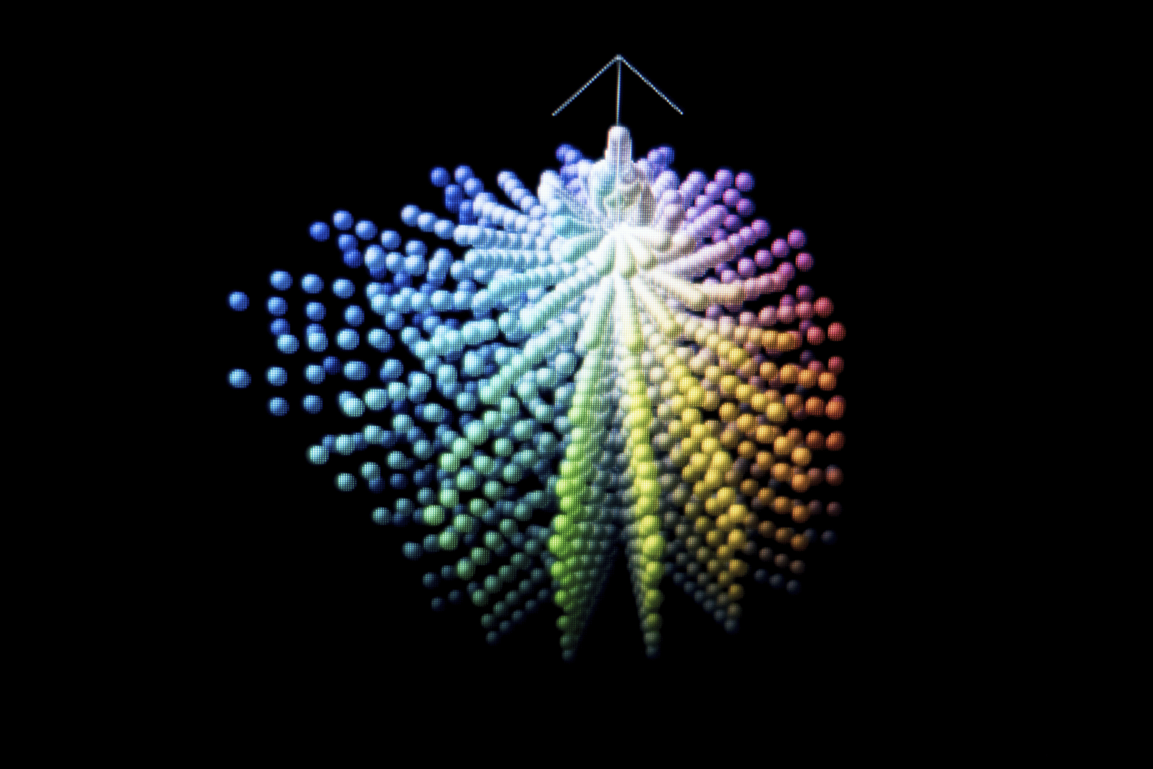
However, if I can touch the red in a tool with an accurate graphical representation of my gamut and tell it where it should be, namely on a very specific colour location, and the result of this operation matches what I expect visually, then we are talking about a new league of digital colour design. If, in addition, neighbouring shaded colours around my red do not run flat, break apart, cause visually unwanted colour noise or create other artefacts in the image, but integrate themselves visually pleasantly into the light-shadow world, even with extreme manipulation, then we are talking about first-class engineering. I have just given the briefest possible outline of a single tool in Baselight version 6, namely X-Grade, which will make many users forget the old Hue Shift in no time at all.
To talk about a tool like Chromogen, which ultimately consists of several sub-tools that are hard to beat in terms of their resilience, would go beyond the scope of this article. In an example of a social media post, I illustrate the functionality and resilience of Sector Squash within the Chromogen toolbox. Sector Squash only works on one half of the colour wheel, e.g. in the blue-green tones. I can manipulate them to an astonishing extent, i.e. change their brightness, colour tonality and intensity, without the affected image elements “falling apart”. Keys/mattes become obsolete in some places as a result.
There are also a number of new options for contrast and temperature control in Chromogen. I can virtually “put together” my look on an operator/layer node. The impact on work in the usually time-sensitive grading process is enormous. These new tools not only make look development extremely versatile, but the look can also be ported through the final grading timeline in a compact and clear way. They are integrated into Filmlight’s colour management system. Other amazing improvements include timeline sorting features and new render settings that can impact entire workflow chains. Baselight’s interface may be a little intimidating for some beginners, but once you’ve got to grips with the software’s logic, new universes open up in which, once you’ve learnt a certain “freedom of movement”, you simply don’t need to know how to get lost.
Lou: Is colour management and a clean dailies final pipeline an important quality feature for you when working with post-production?
Matthias: The first question is what is “clean” (laughs). But of course, I need fixed, predictable parameters on the camera and in post, only then can I play with them creatively and push the limits. That’s why a corresponding post pipeline is also fundamental for me. Because only with a reliable “back-end” can I shoot with mushroom spores in the lens on purpose, as I did with “PARA – Wir sind King”, for example, because I know that this look will run through the entire post-production chain and I can rely on the fact that what I create on set will also be seen onscreen or on the big screen in the end.

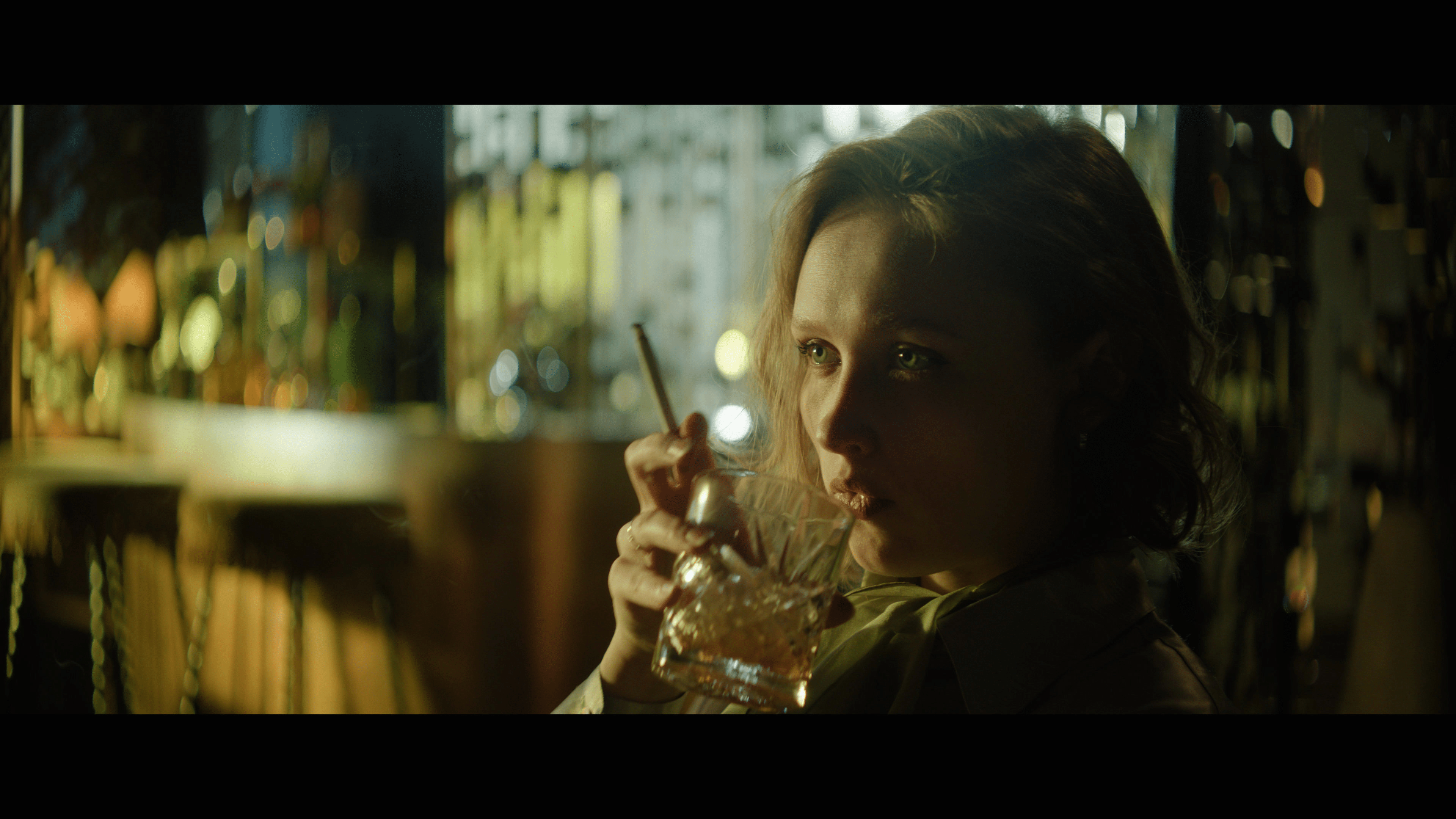
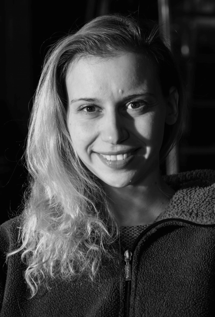
Colourist Louise “Lou” Temmesfeld (see Film & TV Kamera 4/23)
Matthias: Textures are the big issue in colour grading with Baselight, why is that?
Lou: Ever since the advent of cinematography, people have wanted to overcome the two-dimensionality of image reproduction by creating a three-dimensional spatial experience. As soon as I create textures visually, I also associate a certain haptic quality in the film image, i.e. a bridge to something already experienced, a surface texture of materials, particles or the optics themselves. Diffuse points of light are a classic example. They can create a certain aura around bright points of light that tells us something about the room. Perhaps the humidity is high at night, giving the streetlights a certain “halo”. If I create or reinforce this halo with texture tools, then I have a dimension in the film that cannot actually be experienced with a purely two-dimensional image, namely the humidity in the room. I can just as easily use textures to make a mature man look old by emphasising his facial wrinkles. There is a tool in Baselight that can create such effects. It can do much more than just emphasise pixel edges with high contrast – a phenomenon that many people despair of when trying to sharpen digitally. The texture tool in Baselight works based on frequency and takes optical properties into account. It works in both directions: It can either make the light of different frequency bands appear more diffuse or form reliefs. This creates the impression of designed texturing.
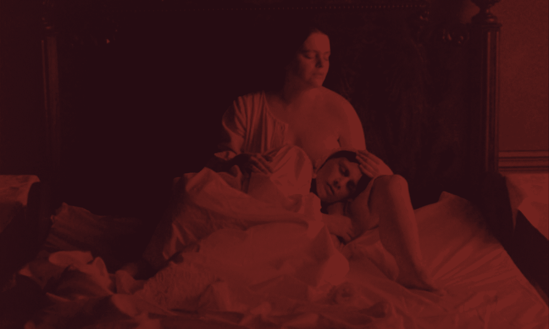

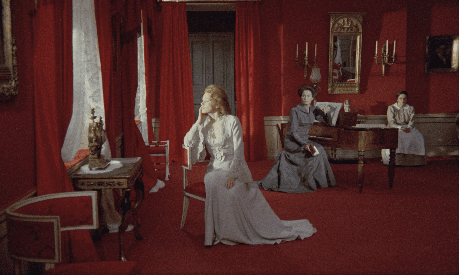
Lou: What are your sources of inspiration for looks, do they necessarily always have something to do with the medium of film? Do you have your own style? Does look also have something to do with taste for you?
Matthias: Oh, that’s just a series of questions – firstly about the sources of inspiration: It can be anything, an illustrated book, an exhibition, everyday life, but also other film stills or scenes. I often feel like a “sponge with antennae” when I’m preparing a project and absorb a lot of inspiration. I try to create a mood board with various inspiring visual elements that I can refer back to as I develop the look. No, not all sources of inspiration have to have something to do with the medium of film, I often feel freer if they are not film stills. I leave it to others to judge whether I have my own style, but I do have preferences as to how I approach a project and how I realise the ideas creatively. So for me, look is very subjective and clearly has something to do with personal taste. On the other hand, I think it’s almost an honour to come to different realisations with different directors, because the content defines the form and not the other way round.
Matthias: A DoP comes with an external wonder LUT (look-up table) and wants to use it for the project. What do you see as the fundamental problem with this way of working?
Lou: I’ve never had a miracle happen with a LUT (laughs). Now there are potentially two discussions that come up in a scenario like this. One discussion is purely technical, the other is artistic. LUTs are technical tools. Originally coming from accounting, they translate a value A into a value B using a conversion table (look-up table) – a fairly simple principle. It is important to know which colour spaces this conversion refers to, i.e. which colometrics were the input and which were the output? How were they calibrated? On which aperture was the LUT created under which settings? For which lighting situation? With which colour scheme on set? Is it consistent or corrupt? If so, at what point? Are technical conversions baked in? The so-called “creative LUTs” don’t answer these questions for me, they just convert. From A to B – nothing more. They often circulate in an untested and inadequately labelled manner. In addition, most LUTs refer to the SDR output colour space Rec.709. This means that they do not work for HDR evaluations, are a bottleneck in cinema productions and even more so in wide-gamut archiving. LUTs are inconvenient in existing colour management systems.
In the worst case, they can be visually corrupt, which is a high risk for the colourist. They can be performance-intensive, which is less and less of a problem these days, but not a factor that can be ruled out. Above all, creative LUTs can be creatively limiting, as they already sort the material in a very defined direction in terms of contrast and colour palette, which takes away my flexibility in colour design. To sum up: I first have to test this “foreign” LUT in a technically productive way, and then perhaps realise afterwards that the LUT is not suitable for me. In my opinion, however, the second discussion is not only more interesting, but also more informative and efficient. It raises the question of why the DoP wants to use this LUT? This question should not put the DoP under pressure to justify him/herself, but rather encourage discussion about the desired look, the image contrast and a colour palette.

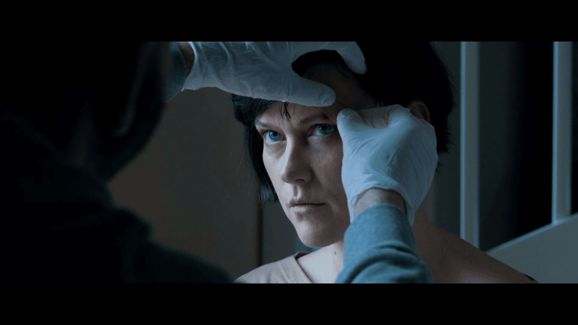
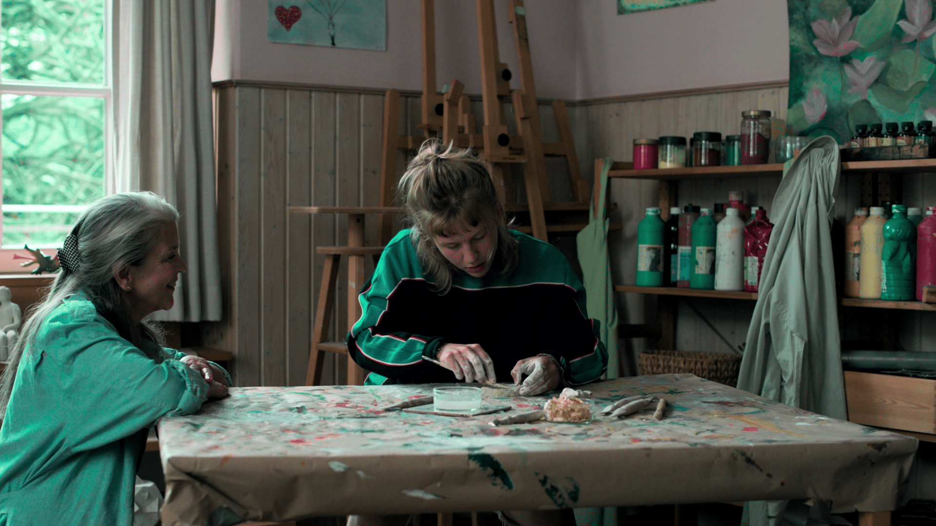
blue modulation of the colour palette, stable in playback and without colour noise. Courtesy of DoP Oliver Kiedos,
Colourist Louise “Lou” Temmesfeld, courtesy of Hamburg Media School, 2023.
Matthias: What tools do you have in your toolbox as a colourist and what are the colour management systems all about?
Lou: As a rule, I don’t bring a toolbox in the sense of my own LUT collection or Power Grades, which I then “search through” with the DoP. One reason for this is that I want to remain open to the film material and prefer to modulate it myself. That’s not to say that I don’t have a LUT & look collection, but I’ve found that it can take away a lot of the potential to develop your own ideas when developing the look, especially if you bring visually very predefined LUTs into play. That’s what I meant at the beginning about creatively “restrictive” LUTs. It also depends on the type: It helps some DoPs if you offer two to three look directions. However, I usually work these out in advance so that I at least have developed my own ideas and thoughts about the film, especially with regard to the story.
Another reason is that I have mainly worked with Baselight in recent years. Baselight uses its own colour management system. In the rare case of a lack of planning, there are already some “look” directions on board that you can sprinkle into the material or use as a basis for further development. They are integrated into the colour management system. Since version 6 with the new Chromogen, the possibilities in this respect have multiplied.
Long before ACES was on everyone’s lips, Filmlight had taken numerous film spectral measurements and started to mathematically record colometric properties using analogue film material. One of the results of this was the Truelight system, which was used in particular around the noughties, when digital intermediate workflows were still increasingly common. It was used to offer so-called print-film emulations. It did this by modulating more complex colour space conversions, i.e. using transform formulas and algorithms, whereas at that time simple LUTs were still being used for this purpose elsewhere. Filmlight was already at the forefront of producing the first practical colour management systems for our industry.
In today’s colour management systems, I can display what my input is, which colour space I want to work in and which colour space I want to see as the output at the end. It manages the light from the set via grading to our display. On the one hand, it’s about control, even over different types of material, and on the other hand it’s also about recording the grading decisions sustainably and with as little loss as possible. In a system where we know where light colours are located, we can also say where they should be instead – in other words, we can “map” them. This means that so-called trim passes or conversions are not only technically possible, but – if cleverly implemented – the result is amazingly precise and saves time.
This is why many software providers, including Davinci Resolve, have opened many doors for users with the Academy standard, namely the ACES system. It follows a similar principle to Baselight’s colour management. In the meantime, most of the initial deficits and errors in the ACES system have also been ironed out. It is a recognised standard that many productions use.
However, I rarely use an ACES workflow in Baselight, as the curves and colour space conversions in the in-house system are not only watertight, but in my opinion can produce “finer-grained” results in combination with the internal tools.
So all I can say about the “toolbox” is that a lot is already on board, regardless of which modern system you are using. However, when you start grading in an unknown house, a reliable test chart can be very useful to check the playback medium and the video signal. Artistically, scanned grain can be interesting for some people.
I create the look myself individually for each project, because every film should have its own character. In most cases, visual ideas have already been exchanged in preliminary discussions with the DoP. In the best case scenario, I also have some time to touch the material before the DoP arrives. You should avoid seeing a flat logarithmic image for a long time at the beginning, as this is the least meaningful starting point for developing a look.

Lou: How exactly do you translate your visual vision with other departments on set such as production design, costume and make-up design, lighting technicians…? What tools do you use for this?
Matthias: It really depends a lot on the department. I often try to incorporate my ideas using references. This also allows me to respond more individually to queries and comments or even initiate a conversation. Elements for this can be individual images from the mood collection (e.g. from shotdeck.com or film-grab.com), the self-made show lookbook or the screen tests that were shot. Especially with production design, this is also a long, in-depth and continuous process in many individual phases and stages. The production design department is often the first department to open up communication on “world building” with a mood board. I find this an enormously central element, especially at the beginning of every production. After that, I stay in contact with the production design department throughout the entire collaboration, from the initial ideas to the final samples.
Matthias: Are there any options on your grading tool that you miss and would like to have changed? And what do you think digital colour grading will look like in ten years’ time? Do you dare to give us a vague outlook?
Lou: You usually only notice what’s missing in certain applications or borderline cases. Basically, I can’t complain about Baselight, especially the new version 6 with its powerful look development tools. Davinci Resolve has also caught up considerably. Nowadays, it is already a major undertaking to really get to grips with all the tools within a grading system. There doesn’t have to be a specific tool for every colourist’s need or use case.
Nevertheless, VFX in particular has provided impetus for grading system manufacturers in recent years to also integrate certain tools into their grading software, such as camera shaking, perspective tracking, paint tools… Grading tools are constantly evolving and now also implement artificial intelligence. When asked where colour grading will be in 10 years’ time, I can only assume that AI will move further into the post-production process chain. Manual work and manual set-up, especially of rudimentary tasks, will be (partially) automated.
At best, we colourists will have an AI sitting next to us as a co-pilot, giving it commands that will be implemented at a speed that is impossible to keep track of. Databases of existing looks will certainly also be requested in order to present designs and try out directions. People will remain in demand as “intellectual creators” because they are the necessary “delay” in the chain to allow ideas to mature and to abstract them mentally. I think that aesthetically sophisticated image design that has gone through a human-creative value chain will remain the attraction that will keep people standing in front of the cinema screens in the future too


