Table of Contents Show
With Task Force Querlitz, screenwriter Simon Thummet, director Arne Hain and producer Sebastian Simon have achieved something rare: a German adult animation series produced entirely for public broadcaster ZDF. Produced by the Offenbach-based animation and film studio PixelPEC, the show combines Moho and After Effects to deliver 60 minutes of animated anarchy. Despite its clean, colourful style, it refuses to look American. We spoke with the creative leads…
The Overview: We’re Talking to the Director

Arne Hain is a German animation director and stop-motion artist known for his handcrafted, character-driven storytelling. A graduate of Filmakademie Baden-Württemberg, Hain combines traditional and digital techniques, always tailoring the visual style to the project’s tone. His diverse credits range from Phil Tippett’s MAD GOD and Star Wars: The Rise of Skywalker to commercials and award-winning shorts like The Last Bar. With Task Force Querlitz, Hain directs his first major TV series, pushing German animation into adult territory. Website | IMDb | LinkedIn
DP: Why adult animation, and why now, in Germany?
Arne Hain: As a person from the animation world I believe that animation is a medium to tell all kinds of stories, not only those aimed at kids. Animation can do anything and clearly that has long been recognized internationally. There is a big demand for adult animation and a lot of very successful shows out there.
Germany is still in the middle ages when it comes to adult animation. There have been close to no shows created directly out of Germany. But slowly the broadcasters are trying to change their approach. A big reason for this are the streamers and that the broadcasters see a need to build up their own streaming platforms now. They also want to broaden their target audience and make it younger. Adult animation has a very specific target audience that the public broadcasters have not reached yet. Thats a big reason why we got the chance to make this show now. The rest of course was funding situations and a bit of luck.

DP: When you pitched an adult animation sitcom, where did you meet the most resistance? Was it the format, the tone, the budget, or the schedule?
Arne Hain: I came into the project a little later and can only give an insight into this topic kind of second hand. The project was initialised by Sebastian Simon (the co-founder of PixelPEC) and written by Simon Thummet. The two of them where the people who really sold the idea initially. I came in shortly before the actual writing started.
“Task Force Querlitz” is a co-production between ZDF Quantum and Hessen Film und Medien funding. ZDF Quantum was super open to adult animation and our creative editor Jakob Zimmermann always pushed us to be bold. So I can really say that we had no backlash creatively. We did have to produce the whole show in one year, which was tricky. But since we agreed on realizing 3 Episodes, that was possible without sacrificing the quality of the show.

DP: How much did your Filmakademie network play a role in assembling the team?
Arne Hain: I was able to get a handful of people from my Filmakademie Network into the Lead positions, which was really helpful. It is always good to have people on board who you already know and trust. But I have to say that the whole team was very well picked and everyone (not only the Filmakademie people ;-)) did an amazing job. We also worked together with PIROS from Budapest and they were amazing.
Our team consisted mostly of very young talents directly from filmschool, which is a chance and a challenge at the same time. We had the chance to grow together, but of course we also had to create the complete workflow and pipeline from scratch. In the end I think the show benefited from this, because everyone could really add something personal to the project.
DP: From the pilot to the end of season one, how did your characters evolve visually?
Arne Hain: As mentioned the first season is 3 times 20min long. We really produced a lot of it parallel and the difference between the episodes is not really visible. Which I am of course happy about.
But in finding the initial visual style we did change a lot. Initially we were actually aiming to use a mixed media style with different animation techniques. But we quickly realized that would not work in the budget and also might not be the right fit for the narrative. In the end we decided for a much simpler and cleaner look, which also had to do with the workflow. Since we worked in Moho and the characters had to be rigged, we already had to think about this aspect in the design. We did have a lot of moments where we realized: Damn, this aspect of the design will not work in Moho, we need to adjust it.
The whole Design aspect was really held together by our art director Janis Frank (Instagram), he had a big influence on the final look and I am very happy with the quality we were able to achieve in the end.

Making it move!

Dana Yeva Petrov is a 2D animator and illustrator specializing in expressive, character-driven storytelling. Her portfolio spans short films, animation series development, and comics, showcasing a love for dynamic poses, vibrant timing, and clear emotional beats. On Task Force Querlitz, she served as Animation Lead
DP: How did you refine the characters after the first internal test shots?
Dana Petrov: My job was testing the rigs, not building them, so I can talk only from this perspective. When making the test shots, I focused on three main things: the complexity of the rig (the rigs had to be relatively easy to use for animators without extensive moho experience), the range of motion, and the bugs.
We had a lot of communication with the riggers to find and fix all the glitches, but also to learn how each rig operates and how to fix some recurring bugs on the run. I’m not a rigging expert myself, so I relied on our rigging team for technical solutions and support – and they did an amazing job, never leaving an unanswered question.
DP: What does a fully rigged character look like under the hood in your current setup?
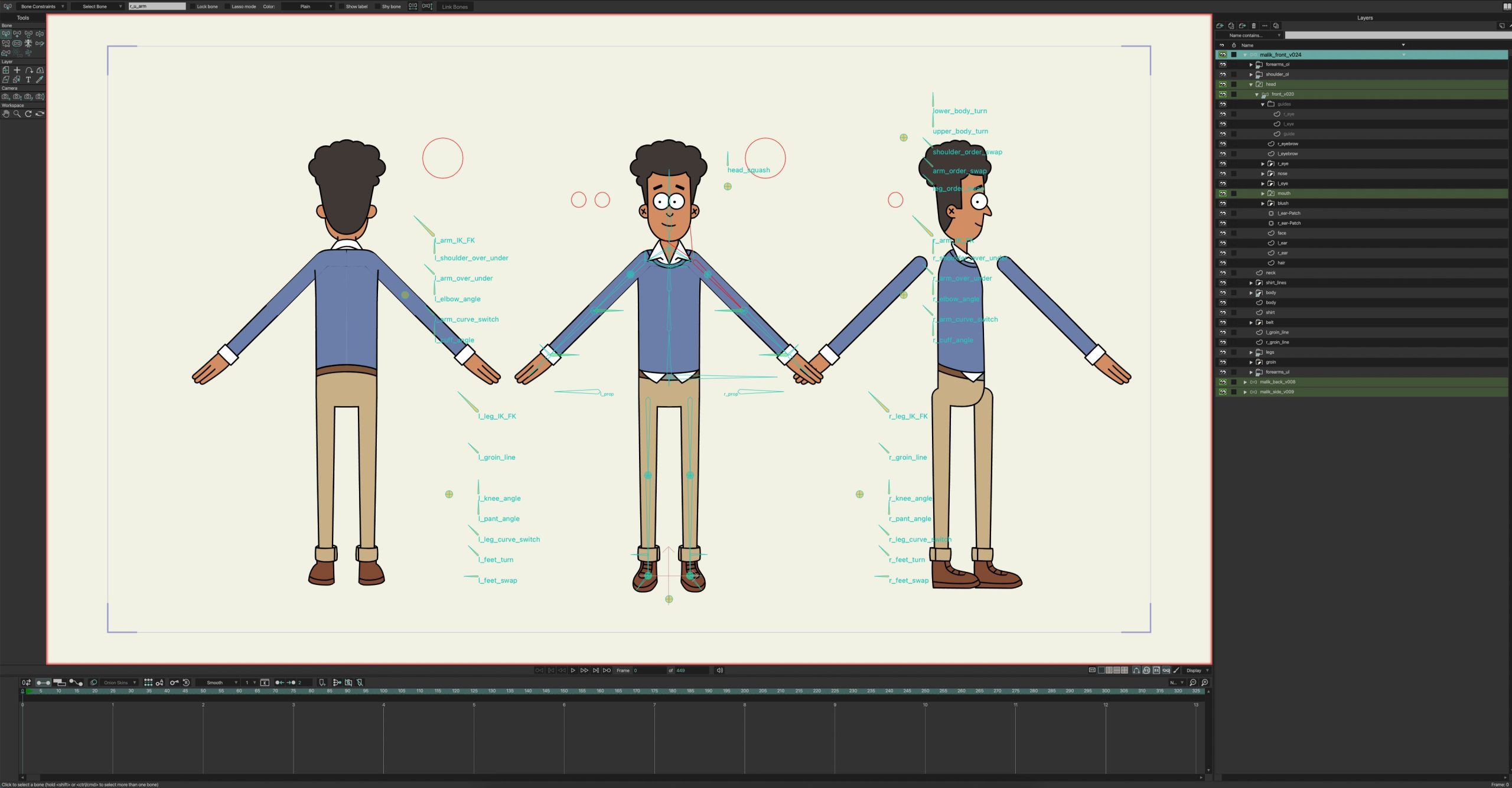
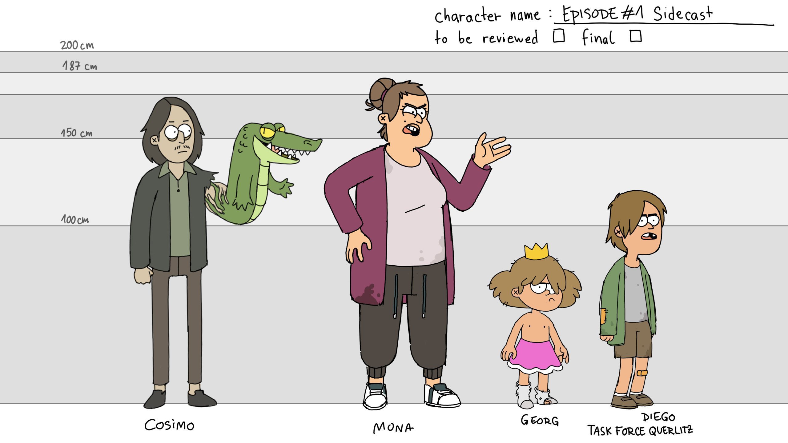
Dana Petrov: There are 2 kinds of characters in the show the simple rigs and the fancy rigs. Side characters that we only see for a few scenes got a simple rig: IK/FK controls for the limbs, a switch for the head turn, a blink switch, and a body turn switch that goes from front to ¾ view.
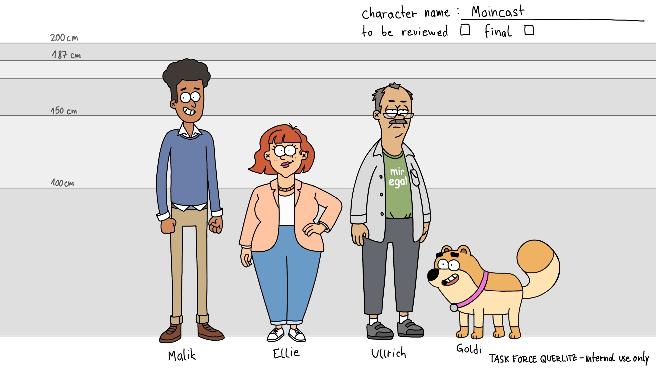
The fancy rig is for the main cast: they got a full turn around, with separate rigs for front, side, and back views. When a character had to turn around on screen, we would swap the rigs. These rigs have a big motion range, with controllers to do almost anything, including blushing and moving the character’s hair. In a rig like that, the head rig is placed on a different layer than the body, which makes it a bit more complicated to animate, but it’s worth it for the versatility it offers. My favorite rig is Goldie’s (built by our lead on the Hungarian team, Tina Orosz). It has a switch to give Goldie starry eyes!


DP: How did you keep Episode 3 consistent with Episode 1 in terms of character look and movement?
Dana Petrov: Before starting production, we had a little “animation bootcamp” for the leads – Oscar and me on the German team, and Tina and Domi on the Hungarian team. For two weeks, we worked on understanding the characters and developing the animation style. By the end of this time, we had an animation guide for each of the main characters. We also created a workflow guide to help the animators achieve the specific appeal we were going for in the animation: bouncy and fun, but not over-exaggerated.
During production, all shots went through 2 rounds of feedback, so any inconsistencies were fixed then. We had morning meetings every 2 days where we watched all the new shots and Arne gave us some pointers about the acting, so if one animator had a cool idea, the other ones could learn about it and use it too. There was also a lot of communication and information sharing between the teams.

Another thing that helped was the way we divided the shots: if an animator had a way with a specific character, we tried to assign them scenes where that character is in the spotlight.
DP: What was the reasoning behind choosing moho, and did you experience fit the expectations?
Dana Petrov: Working in Moho definitely helped :D Here’s why we chose Moho: We chose moho for this project because it’s accessible and intuitive. We needed a program that would allow us to create rigs that are at the same time versatile and easy to use, and Moho is a great choice for that, as an animator, you get a very streamlined experience working with this software.
Some of the animators on the project had zero previous experience with moho, and since we only had 3.5 months to create 60 minutes of animation, the learning curve had to be very steep. We created a detailed workflow for everyone to follow and a beginner Moho animation guide. By the end of the first month, everyone was comfortable with the software and could focus on creating awesome animation.


Dana Petrov: Our goal was for each animator to achieve 6 seconds of animation a day, so most shots took a day to 2 days, but that’s just on average. The turnaround time depended on the complexity of the shots, the number of characters, and the interaction between them. A medium shot of a talking character would take about a day of work (or a bit more if it’s long). A shot with 4 main characters that interact physically, a bunch of extras, and some animals on top could take more than 5 days of work.
DP: Where did things bottleneck most often in animation?
Dana Petrov: They mostly didn’t. I’m actually a bit surprised about how smoothly things went. It was partly thanks to our pipeline, all rigs were ready and tested before the animation production started, and we used Flow for tracking the animation progress and the feedback rounds, so we knew when we could chill and when it’s time to push. The other part is the team, everyone was hyped and dedicated and willing to help, so if someone was struggling with a difficult scene, we usually had someone who had already finished their scenes and was free to help out.
DP: If you had to do a second season, would you still rely on this approach or would you aim for a different setup?
Dana Petrov: Generally, I would keep the same animation pipeline; it worked pretty well for us. The only thing I would change is the way we approached the hand replacements on the rigs. We had a replacement library with about 50 hands for the main cast, and it was sometimes clunky to work with. If we get a second season, maybe we can try rigging the hands too, so we can have fewer hands and get more positions out of each one
DP: What are three tips you would give a small team starting animation in Moho tomorrow?
Dana Petrov: Having a clear idea of what I want the animation to look like before even opening Moho helped me a lot when animating. For some shots, I first sketched the main poses on paper. The interpolation can make choices that you wouldn’t make, so it’s good to have a guide. Keeping it simple is also important! Don’t make a fancy rig for a character that doesn’t need it, even if we see it on the screen a lot.
Let’s talk about Comp…

Paul V. Mayer is a motion designer, compositor, and VFX artist based in Germany. A graduate of h_da University of Applied Sciences Darmstadt, he holds a degree in Animation & Game, with additional film studies from Plymouth College of Art in the UK. Since 2017, Mayer has worked as a freelancer and co-founder of Silent Village Creative Productions, focusing on animation, visual effects, and motion graphics using tools like Cinema 4D, After Effects, and Maya. Now he is working as Senior Motion Designer at PixelPEC and was Lead Compositor on the „Task Force Querlitz“ project.“
Website | LinkedIn | Vimeo | Instagram
DP: Why did you build the show around Moho and After Effects instead of a dedicated pipeline like Toon Boom, Blender, Harmony, or Unreal?
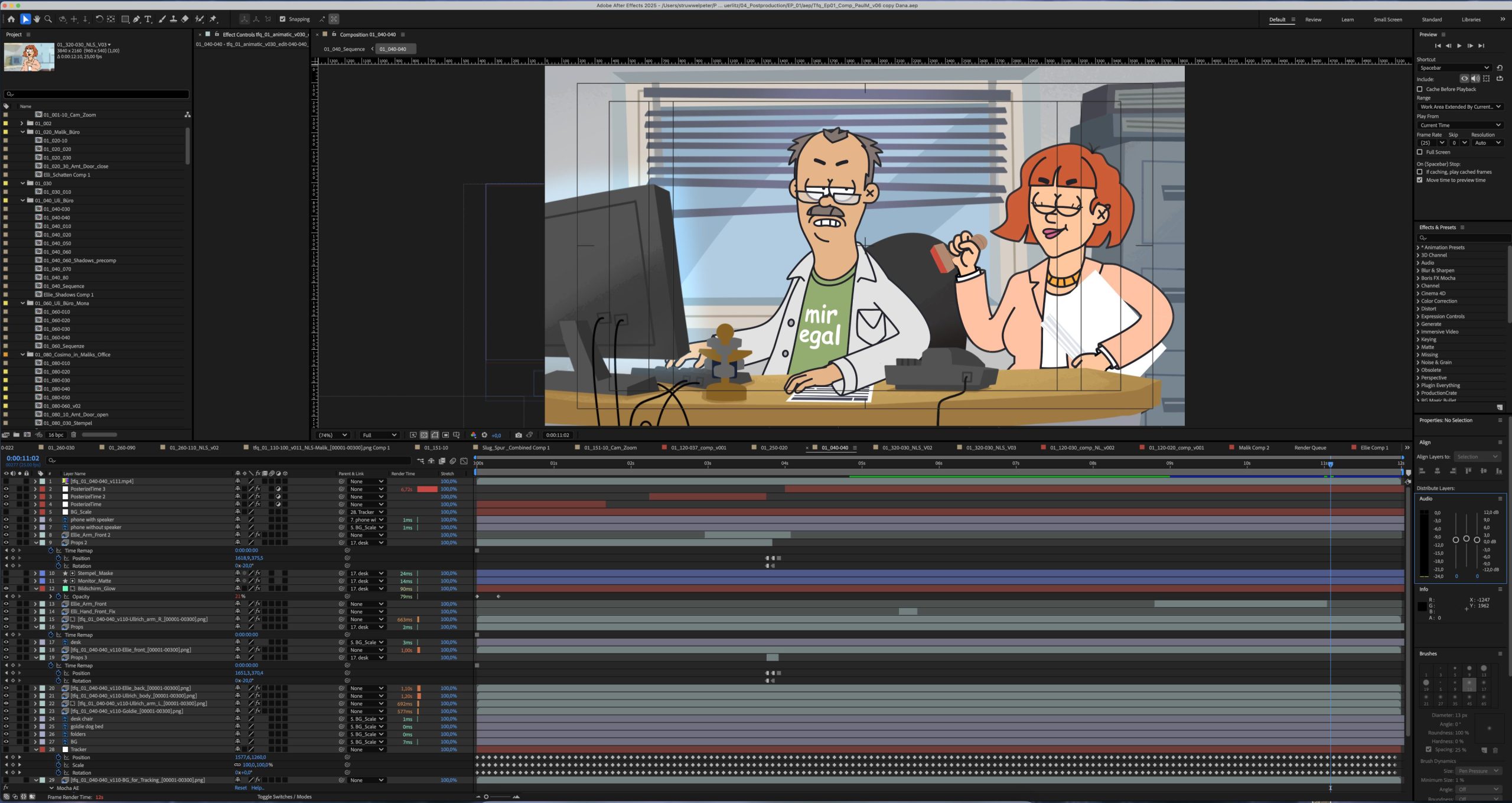
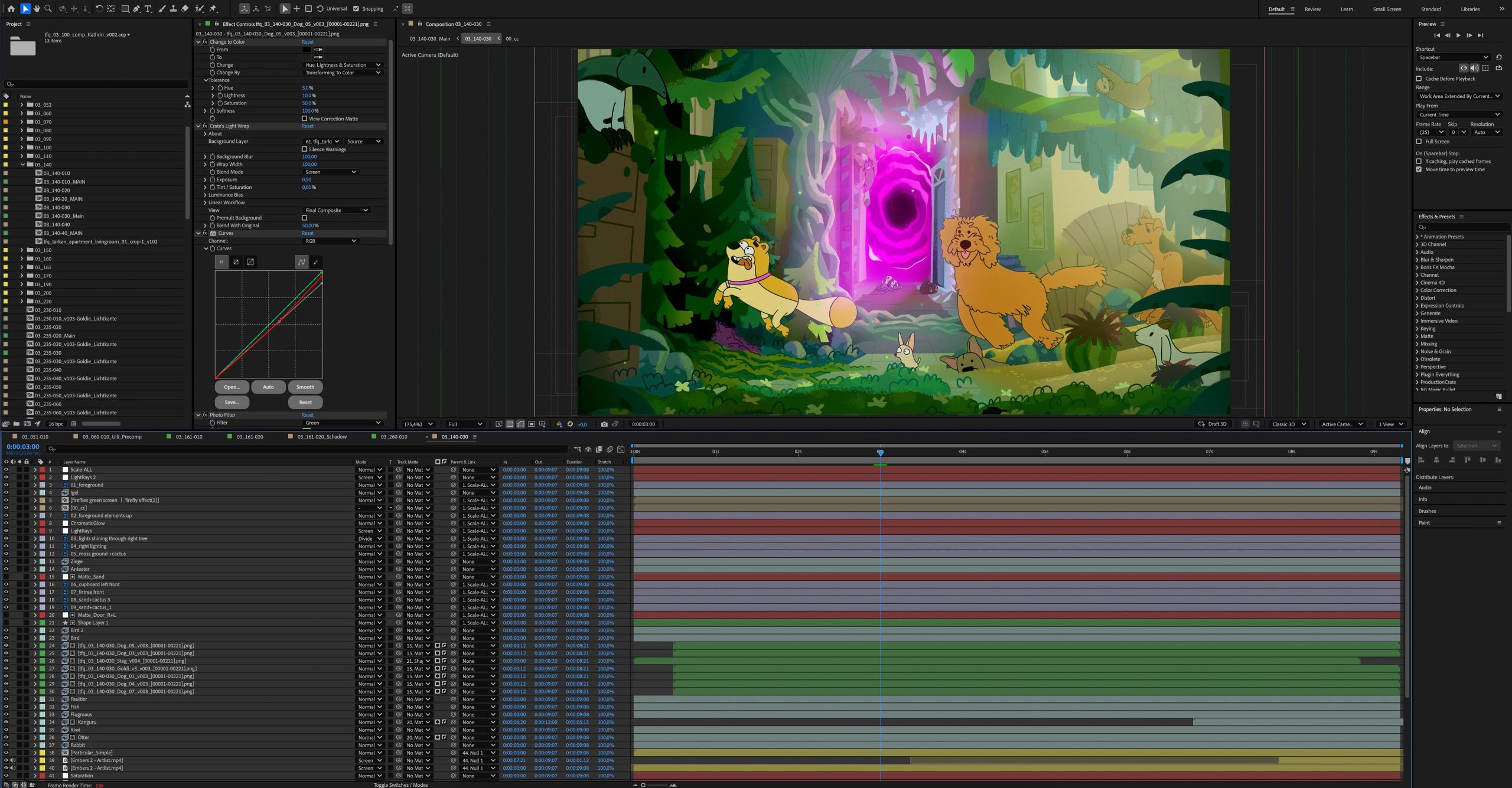
Paul Mayer: After Effects simply integrates very well in the Adobe Cloud. Since the Illustration Department worked with Illustrator and Photoshop, AE came very handy in having all layers separated in AE already. The animators worked with Moho and could give me their animations as Image Sequences. That sped up the pipeline, as there was no need to animate in AE, but only to comp.
Simultaneously AE gave us the possibility to create more complex animations, like the Intro Sequence, Day-to-Night Transitions or a swirling Portal-effect right in the Comp. Another benefit was that most of the Team knew (at least a little) of After effects and could help out, setting up the composition to speed up the pipeline, while I could concentrate on the finishing touches. The finished AE shots were then brought into Premiere Pro, were they replaced the animatic shots (with identical timings) in the timeline and were color coded to keep an overview of what’s still missing.
DP: Where did After Effects shine, and where did it fight you the hardest?
Paul Mayer: After Effects really made it easy to comp all the different backgrounds and characters together, and integrate everything to one coherent image, using the Color Correction tools, Light wraps, Masks, Tracking, Glows, etc. and also allowed us to fix some smaller render issues (from Moho) or create custom shadow edges in dark environments.
For the most parts AE worked really great (It didn’t crash once!), but with huge Photoshop files it struggled and the render took an eternity. Luckily the Illustration department had an eye out for that and merged layers wherever possible.

DP: How did you structure AE projects across episodes?
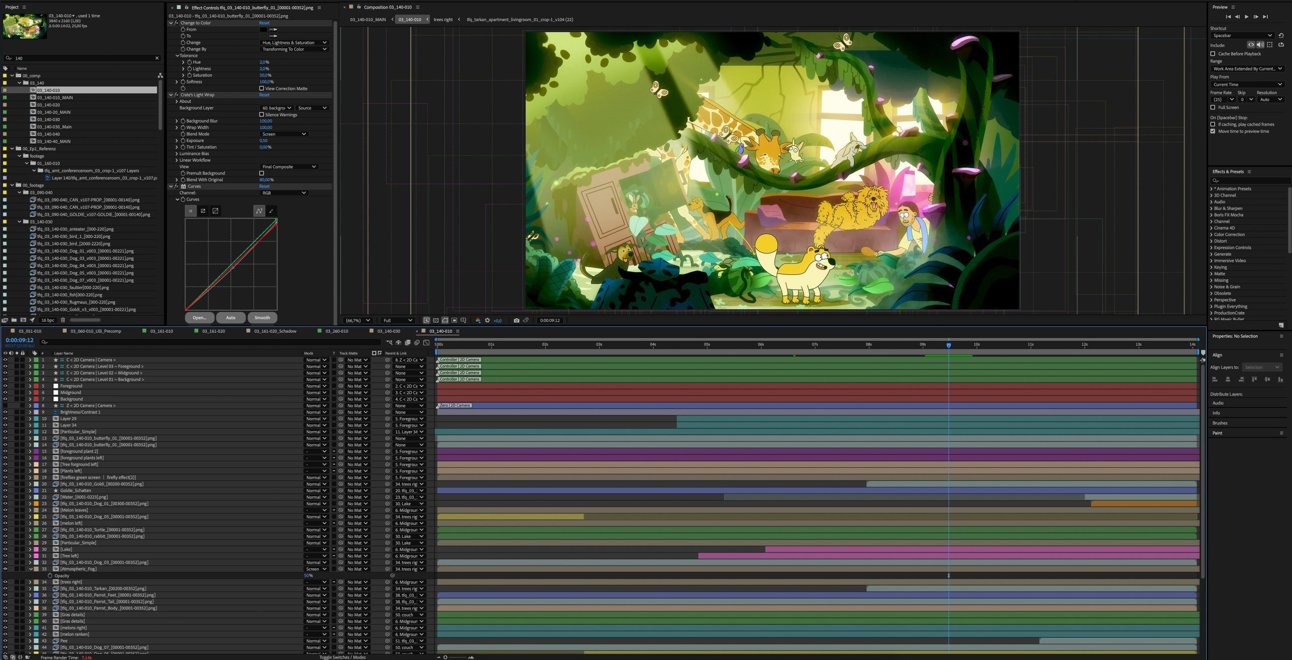
Paul Mayer: Everything was divided into Preproduction, Production, Post and subdivided into their corresponding departments on the server drive which made it easy for us to find all relevant files. To avoid having too big After Effect projects, every Episode had its own AE file with the same naming structure in the projects as well as for the renders like this: “(Episode)_(shot)_(version)”.
In After Effects, the shot compositions were filed away in the classic AE folder hierarchy: “Footage, Comp, Precomp, Solids” And we also made a habit of moving old versions to an “_Old” folder, partly to keep the main folder neat, and partly so we didn’t spend 20 minutes trying to guess which file was actually the latest.
The rendered shots were then stored in the corresponding scene folders on the server drive. Additionally we could always cross-reference those namings with the master Shotlist in Flow (Shotgrid). With over 600 shots, keeping the habit of naming and storing everything correctly was essential. So, fortunately, no more “finalFinalV03FINAL” naming disasters this time. I’ve learned from my past mistakes…
DP: Which plugins or methods became essential during production?
Paul Mayer: Since we only comped in AE, we didn’t use any rigging and animation Plugin like DUIK or Limber. All the animation magic happened in Moho, which honestly wouldn’t have been possible in AE. But one of my favorite third-party plugins (besides Particular and Shine) is “Crates Lightwrap”, it makes adding lightwraps to characters ridiculously easy.
DP: How did you handle reviews and approvals?
Paul Mayer: We used Flow (Shotgrid) for reviews and approval, which works great to keep an overview (also on which background or animation is finished and ready for comping) and quickly get the shots approved.
DP: What was your render strategy?
Paul Mayer: Adobe Media Encoder was our render of choice, simply because you can queue the finished shots and keep working in AE while its rendering.

This needs some more environment…
Tobias Pinegger is a background and environment artist from Germany, with experience in digital painting, concept art, and layout design for animation. A graduate of the Filmakademie Baden-Württemberg, and working with Studio Soi, Pinegger’s work blends stylised, colourful world-building with a distinctly German visual sensibility. In Task Force Querlitz, he served as environment and template lead, shaping the show’s unique balance between cartoon aesthetics and grounded, local detail. LinkedIn | Instagram
DP: This might be the Bavarian in me speaking, but it looks far too colorful to be set in Eastern Germany. Why not make everything in muted concrete grays?
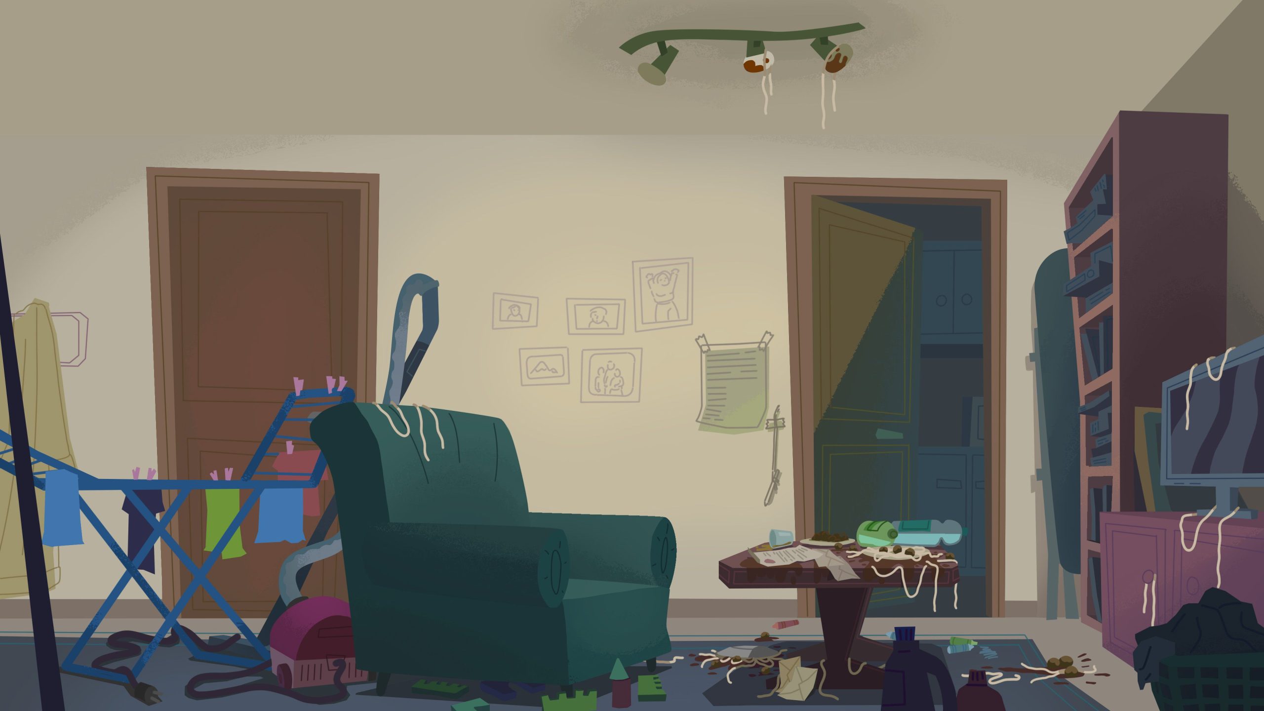
Tobias Pinegger: Oh, you caught me, I’m actually from Bavaria too. But we did not want to go too far into the cliche that east Germany is all gray because of course that is not true. My personal style is certainly one of the reasons why the backgrounds are on the saturated and colorful side. My first impulse, however, was also a more dirty and punk look, to match the anarchistic tone of the story. However, the director and production team decided to establish a friendly, cartoon look to create a contrast to the crude humor of the stories.
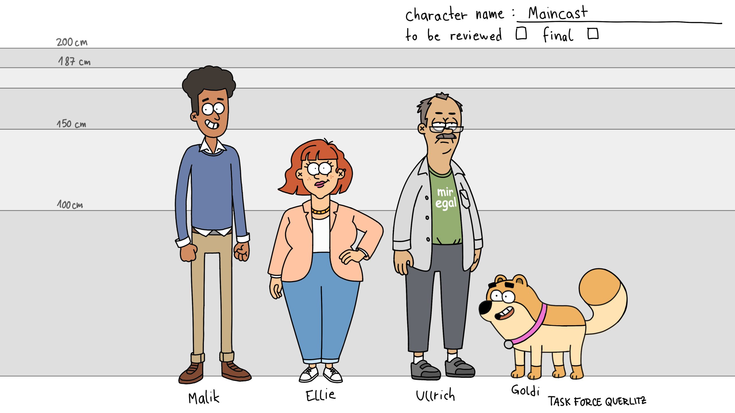
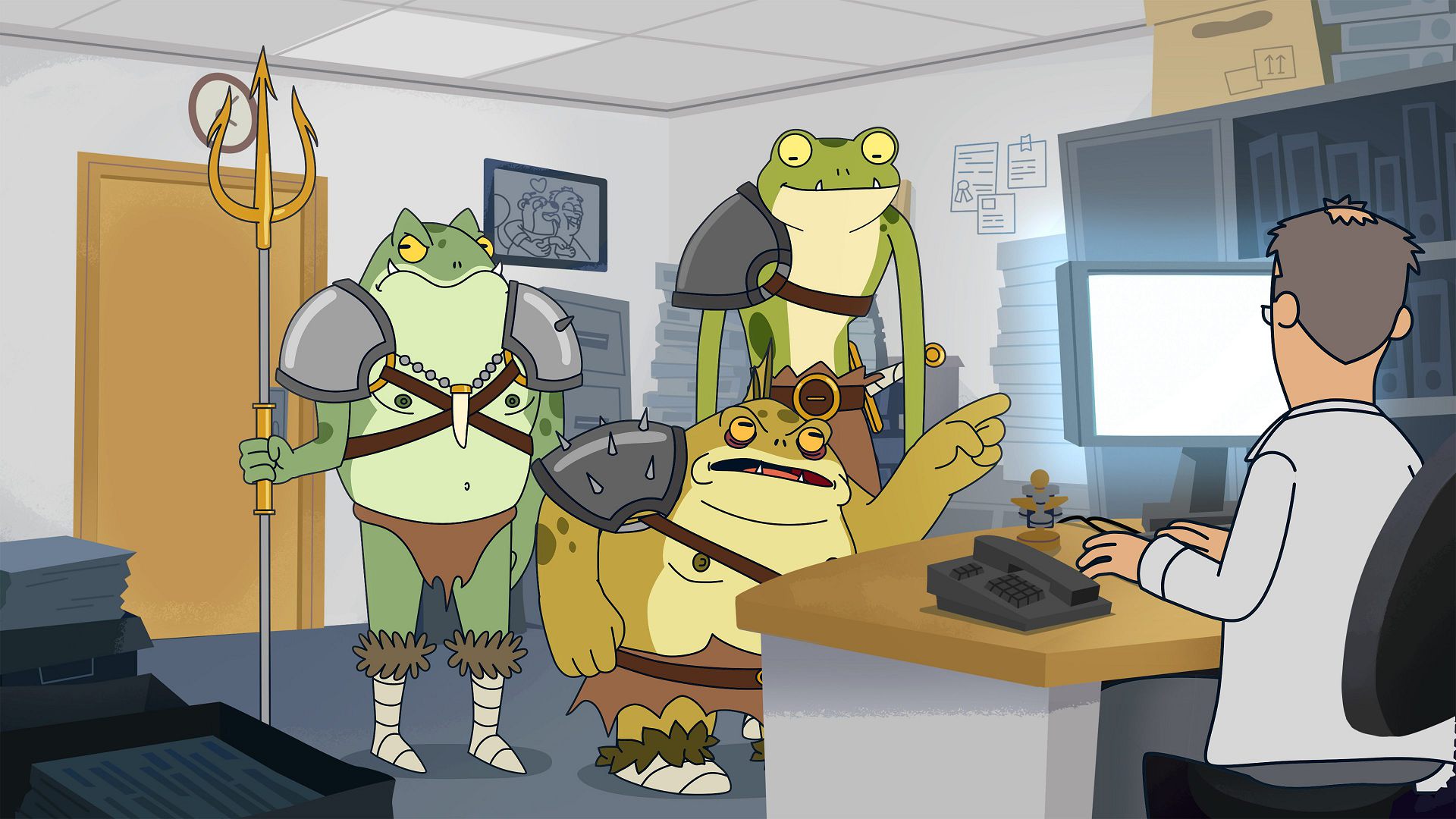
One danger I saw with the cartoon direction was that the stylization could quickly end up looking very American, because American cartoons have had such a strong influence on our viewing habits since childhood. Therefore, we often asked ourselves, “Does this environment perhaps look too much like America?” and then considered, “What clear symbols that embody Germany could work in our stylized backgrounds?” For us, these were things like outdated, clunky technology in the offices. That’s why the fax machine in the intro felt so fitting for us. It simply is very German in a self ironic old fashioned way.
The look is, as mentioned, deliberately colorful, but we still tried to create a sense of sadness and boringness in the office spaces to provide a visual counterpoint to the Anomali madness.
DP: Which design elements changed when moving from style bible to production-ready assets?
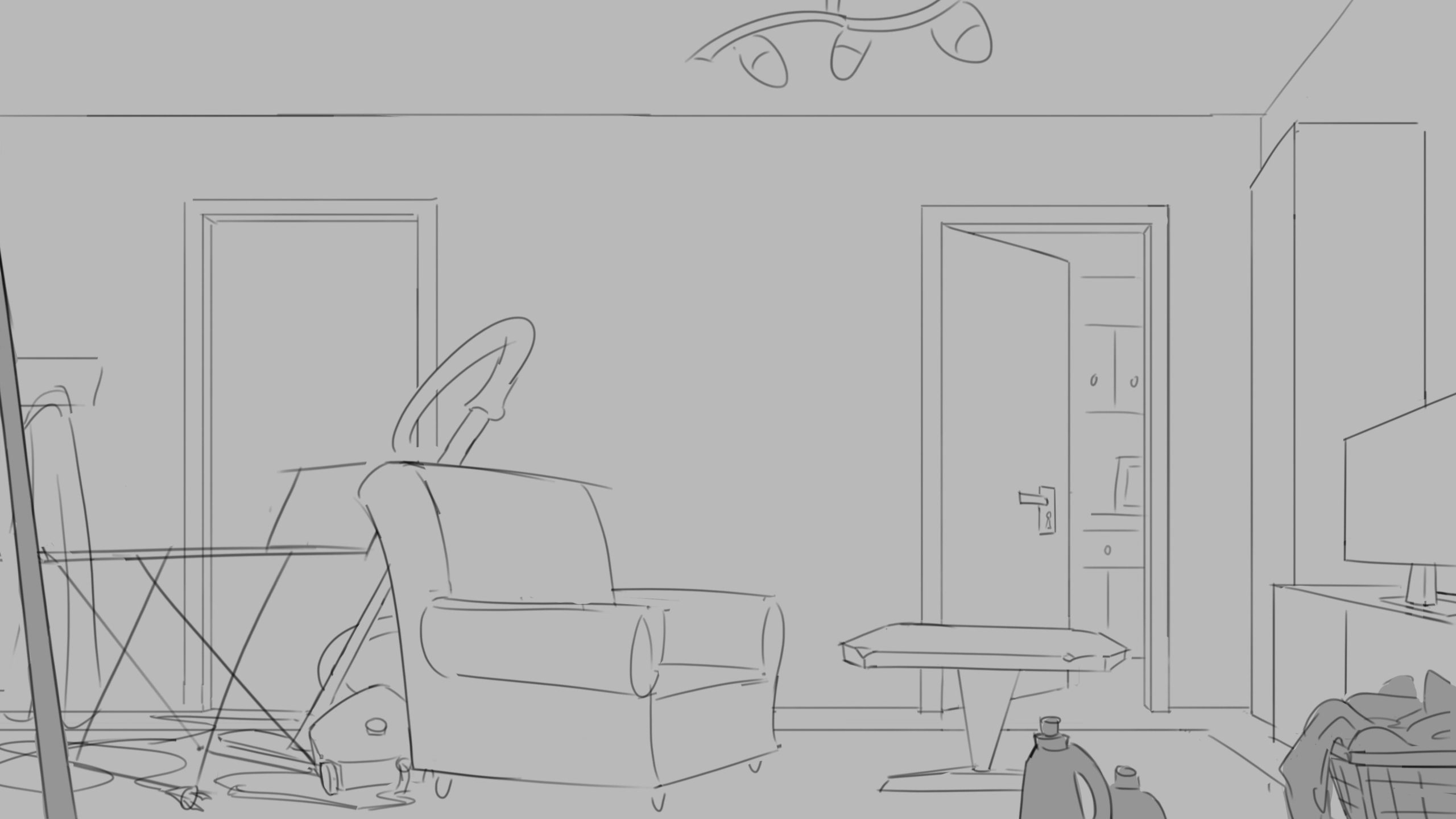
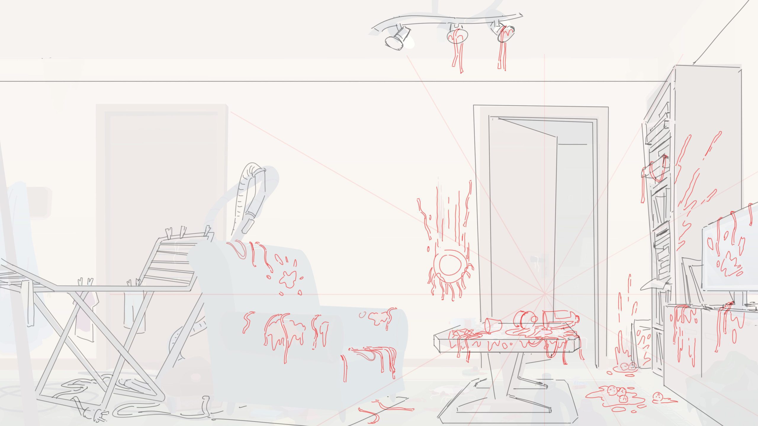
Tobias Pinegger: In order to complete all the backgrounds for the three episodes in a short time with a team of an average of three to five artists, it was important to me to limit the number of backgrounds. We wanted to create only a few large master backgrounds for each location so that we could reuse each background often in sections. At the beginning, we racked our brains over how best to create the backgrounds using our approach, with the numerous crop-ins. Finding the right level of detail for our approach with the master backgrounds wasn’t easy. We actually had quite a long testing phase.


In a previous project, I was able to conceal many imperfections in the crop-in’s using depth of field. However, since TFQ’s backgrounds have a very graphic look, too much depth of field would look odd here. In preproduction, we decided not to use outlines in the backgrounds so that the characters with outlines always stand out clearly from the backgrounds. I had noted that the transition from a drawn layout to a colored background with outlines is much faster, because without outlines, you have to create all the objects in the backgrounds every time from scratch.
However, we later realized that our no-outline look is generally very beneficial when upscaling, as the outline of a background is the most revealing part that tells you it’s an enlarged background. The human eye quickly recognizes when the line thickness changes. So we were lucky that we chose the more complex route of creating the backgrounds without outlines. While we still had to put a lot of work into overpainting the crop-ins, with Outlines we would have had to create all the crop-in Backgrounds from scratch.
DP: What rules kept your backgrounds and environments consistent across episodes?
Tobias Pinegger: As already mentioned, we had to conduct extended testing during the production phase to see how the background look would affect scaling and crop-ins. So, we made quite some changes to the background look quite late in the process. Another important factor in finding the look was the small team of Artists. Especially in such a small team it can’t be ignored that each artist brings their own style.
In our case, it was essential to find a look that the team could pick up fast. You could say that each artist’s personality shaped the look. It took us some time because there was a lot to clarify at the beginning, but once the team had settled on the look, it was no longer a problem to complete the backgrounds towards the end of production.

DP: How did you set up parallax and background layering to keep episodes visually rich but still manageable?
Tobias Pinegger: It was important to me that the background team create each background in Photoshop in orderly layers so that we retained control over all the shapes when we applied changes and feedback. To be honest, the artists did not like that too much because sometimes it could get quite cumbersome to navigate the complex layer structure of the original background files, especially when there are many linked layers and layer dependencies to consider. But this approach also meant we didn’t have to worry too much about how many layers we’d need later. We simply exported all the required background layers as needed in a later step.
Wrap-Up
DP: When you had to deliver to ZDF, what exactly did they require?
Paul Mayer: We delivered an MXF OP1a with 25fps in HD (even though we produced in 4K) with stereo sound.
DP: Did you need separate masters for Mediathek and broadcast, or could you deliver one version?
Paul Mayer: Fortunately we only had to deliver one Master file per Episode for the ZDF. However it is also necessary to upload all episodes as additional MXF (of course with a different codec, why make it easy?) in a BagIt-Format for the mandatory deposit in the Federal Archives (Bundesarchiv). That was a first time uploading something to the Federal Archives for me as well. Now Task Force Querlitz is a piece of history :D
DP: What feedback did ZDF most often send back during QC, and how did you fix it for later episodes?
Arne Hain: The Quality Control happened only once in the end for all three episodes and was super smooth. We actually did not get any remarks. But internally we actually had a lot of bug fixing before we even sent it for QC. I personally still see some bugs that we did not have time to remove ;-) but as long as the viewers don’t see them it’s all good.
DP: Which tools would you recommend other teams learn early, and which tools should they skip unless absolutely necessary?
Dana: For the animation team, knowledge of rigging in Moho can be a great asset. So even if you have a separate rigging team like we did, it’s great when the animators can tweak the rigs by themselves for specific scenes.
Paul Mayer: A production tracking software like Flow, daily meetings on progress and good communication in the team are key. From my side as a heavy After Effects user, I would recommend learning AE since it is a very versatile tool to use for MotionDesign, Animation, VFX, Comping, etc. But also the whole Creative Cloud is a good skill to have.
DP: Beyond season one, what is next?
Sebastian Simon: ZDF Quantum was a fantastic and unique opportunity to produce these first three episodes as a proof of concept. The project was overseen by funding officer Niklas Nissen (HessenFilm), with editorial supervision by Jakob Zimmermann (ZDF/Quantum). We are grateful that Quantum provides a format laboratory that makes such new formats possible in the first place.
Now that we have laid the groundwork and defined the setting for the world, scaling up would be the next big step for us. Adult animation has a good standing internationally, and the German market could seek to join forces here. ‘Task Force Querlitz’ is a great project for this, and we hope to be able to take the next step together with ZDF.


