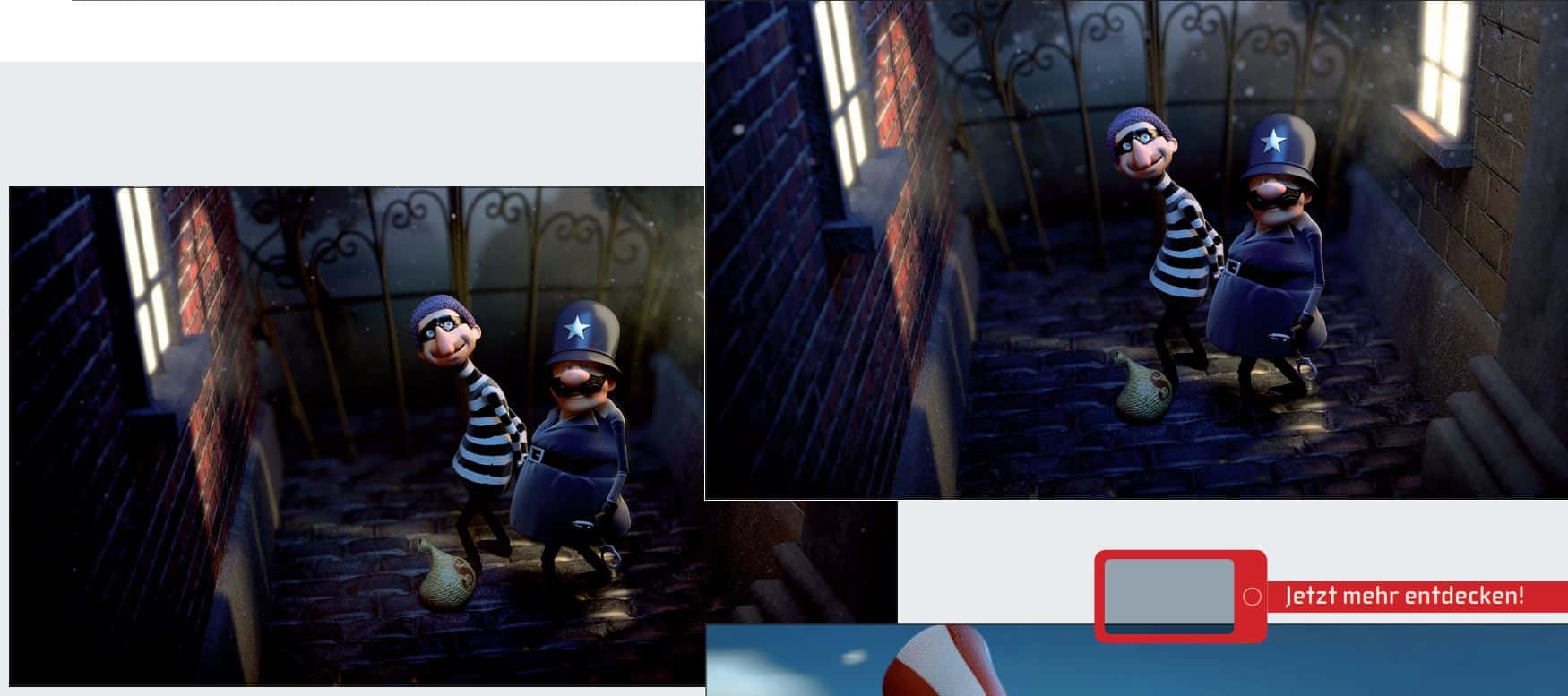
For the European Championships, Coca-Cola commissioned a commercial from Bent Image Lab. Jalal Jemison(jalaljemison.com), Bent’s grader, was responsible for the Cola-typical colours. DP had the chance to ask him a few questions.
Jalal Jemison has gained cinema experience as lead compositor on “Grimm”, as digital compositor on “Get him to the Greek” and other films such as “Borat” and “Religulous”. You can see more in the grading reel at jalaljemison.com/color-reel.
Jemison was responsible for grading this Coke advert under time pressure.
DP: Mr Jemison, how long did it take you to do the grading?
Jalal Jemison: Well, there were several versions of the advert: A summer and a winter version as well as iterations for different teams, in which the jerseys were different, for example. The original spot only took two days to be finalised.
DP: Given the time pressure on commercials, what is your tip for working quickly and how do you prepare for new workflows – such as stereo 3D?
Jalal Jemison: For a full CG spot like this, the preparation has to start in compositing – and that goes double for stereo 3D. And what I think is often neglected – if you’re grading stereo and have mattes for both eyes – is the naming and file structure. It pays to be meticulous here!
DP: How much longer does 3D grading take compared to 2D grading?
Jalal Jemison: Once you start grading and have prepared everything from an editorial and compositing point of view, stereo grading is actually quite easy. However, I would never try to fix convergence or other stereo errors with colour tricks, but send the files straight back to compositing. If you don’t have any special cases, stereo 3D only takes 20 to 30 per cent longer.
DP: As the commercial has a very loud colour language: What elements do you think determine this “feeling” and what do you have to pay attention to when grading?
Jalal Jemison: The general design comes from the art director, of course, and the character and story from the director. But when it comes to grading, I have to interpret it to the extent that I know what to emphasise – but there’s no difference between live action and animation. In this case, I tended to follow the director’s idea and let my personal taste flow into it. I prefer to use masking to emphasise individual aspects and arrange complementary colours around them. For this spot, I used a still life in my mind’s eye and tried to treat the individual aspects separately in order to emphasise and coordinate the colour language of the whole.
DP: How much coordination was necessary with Javier Leon (art director) and Carlos Lascano, the director? Does a permanent team like the one at Bent Image Lab reduce the round-tripping effort?
Jalal Jemison: Javier had a very precise idea. We realised this together in order to have a framework right from the start. In the meantime, we had hands-on sessions from time to time to really make sure that we were realising the idea exactly.
DP: You work with DaVinci Resolve. What are the advantages and what would you like to see in future versions?
Jalal Jemison: I think that every grading package has its advantages. Scratch, for example, is excellent for conforming and versioning. If you have an Autodesk pipeline, Lustre is of course ideal. Resolve has the advantage that it is focussed exclusively on grading. When you work with it, you know exactly what you have – both in terms of the interface and the structure, because everything is geared exclusively towards grading. The Lustre interface or the Scratch interface offer more possibilities, but if you’re only grading you’ll quickly appreciate the specialisation. For the future, I would like to see OFX plug-ins integrated as standard in all Resolve programmes. Especially those with Cuda acceleration, such as Genart’s Sapphire. This would add excellent options for blur, grain and lens flares.
DP: If someone has not yet graded 3D: Can you transfer the materials and masks from the left eye to the right eye, or vice versa?
Jalal Jemison: Unfortunately, you can’t transfer masks and tracking points – the mattes are different for each eye. But of course you can use the keying as a guide. DP: How did you get into grading? Jalal Jemison: The fascination for colouring came from filmmaking and compositing. I come from a film background so I always had the whole workflow in mind, from shooting to final delivery. Even though I have a degree from a film school, most of my skills were acquired through self-study. A fascination for the subject is the best teacher.

DP: If someone wants to become a grader – what training would you recommend?
Jalal Jemison: My advice would be to read up really deeply and then do an internship or practical training with the best possible grader – experience is the be-all and end-all in grading. If you want to attend courses, I would recommend the International Colourist Academy icolorist.com.
DP: How do you explain grading, and what is the film that you think best shows the possibilities?
Jalal Jemison: A colourist is someone who defines the emphasis of the individual elements of a picture, highlighting and de-emphasising them, defining the overall look of a film and preparing the colours for the different playout channels. These days that includes film, HD tape masters and also H264 for the web. In my opinion, Del Toro’s “Pan’s Labyrinth” is one of the most visually stunning films and in many scenes sets the bar for visual perfection. The colour composition, the contrasts between warm and cold colours and the overall design of the scenes are for me the highest level of what colour, compositing and light can produce. And since some of it came from the live action film, some from compositing and some from grading, this interplay is responsible for the breathtaking images.


